Creating a swimsuit with a gorgeous print requires more than just picking a pretty fabric – it demands careful planning of print placement. Swimwear fabrics are very stretchy and form-fitting, which means a print can distort or end up in unintended spots once the suit is worn. For example, a motif that looks centered on flat fabric might stretch into an odd shape on the body. The challenge is to anticipate how the print will behave on curves and in motion, so your final garment looks as good in use as it does on the cutting table.
Another big consideration is alignment. A swimsuit often has multiple panels (front, back, cups, etc.), and if you’re not mindful, the print won’t line up at the seams or along the body’s symmetry. Ever seen a swimsuit where a stripe or pattern suddenly “jumps” at a side seam? Misaligned prints can make even a professionally sewn suit look off. Additionally, because swimwear is usually worn tight, an unfortunately placed motif (like a big flower at the crotch or bust apex) can be embarrassing. In short, print placement is critical – it affects both the visual appeal of the swimsuit and the comfort and confidence of the person wearing it.
Educational Overview
What is “print placement” in swimwear design, and why does it matter? In fashion terms, print placement refers to deliberately positioning a print’s elements on a garment rather than just using a random section of patterned fabric. Unlike an “all-over print” where a design repeats across the entire fabric roll, a placement print involves a specific motif arranged for each garment piece. In swimwear, this could mean centering a medallion on the front of a one-piece or ensuring a logo lands on the hip of each bikini. Good print placement elevates a design by making it look intentional and flattering.
Key Challenges in Swimwear Print Placement:
- Distortion from Stretch: Swim fabrics have significant 4-way stretch and are often sewn with negative ease (smaller than body measurements), so they expand on the body. This can warp prints – a circle might turn into an oval, or a leopard spot might enlarge in a high-stress area. Always test how a fabric’s print looks when stretched to body dimensions (for instance, by stretching a swatch over a curve). If a print drastically distorts or loses its clarity when the fabric is worn, you’ll need to adjust motif placement or choose a different print.
- Panel Alignment and Mismatches: Most swimsuits are made of multiple pattern pieces. Without planning, a continuous print can look disjointed at the seams. Stripes or geometric patterns are notorious for this – if you don’t match them across seam lines, the break in pattern is very noticeable. It’s worth the extra time to match prints at seams for a professional finish, especially at center front, side seams, or anywhere the print’s continuity matters. Symmetry is another factor: if a print is meant to be mirrored on left and right sides (like a pair of bikini cups with identical placement), you must cut the fabric accordingly.
- Unflattering or Awkward Motif Placement: Because swimwear hugs the body, certain motifs can draw unwanted attention if placed incorrectly. A classic rule is avoiding focal motifs on areas like the crotch or directly over nipples. Similarly, designers caution against things like perfectly round shapes over the bust apex – it creates a “target” effect. One swim print expert even notes that front-facing flowers with circular centers or mandala designs can become unintended eye-catchers if they land on the bust. Long, vertical motifs can pose issues too; for example, an elongated flower stamen could look unfortunately suggestive if it ends up over the lower torso. The takeaway: scrutinize your print for any element that might be misread or awkward on a curvy human form.
In summary, print placement matters because it ensures your beautiful fabric print actually enhances the swimwear design. It’s about controlling where each part of the pattern goes so the finished swimsuit is visually harmonious, free of distortion, and devoid of any unintended visual jokes. Next, we’ll dive into how different swimwear fabrics and printing methods affect your placement strategy.
Technical Print Behavior by Fabric Type
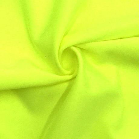
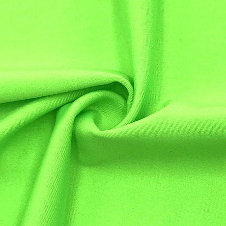
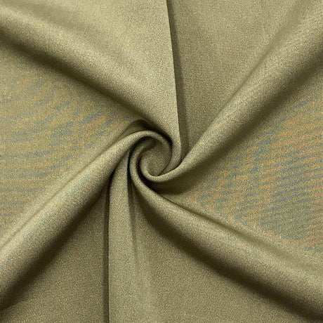
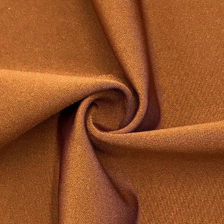
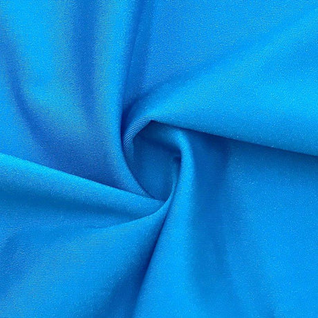
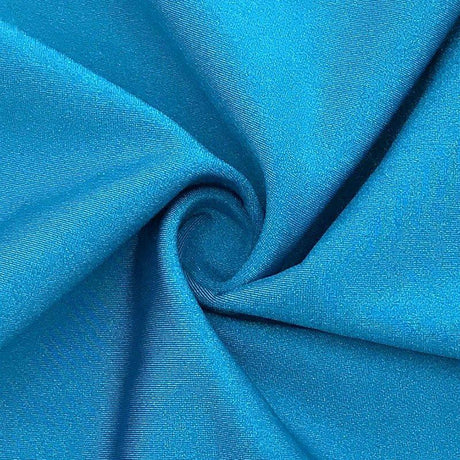
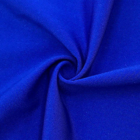
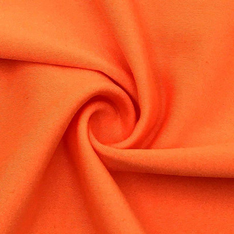
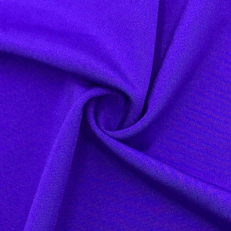
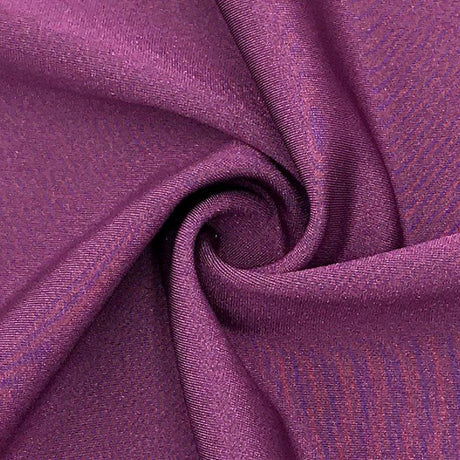
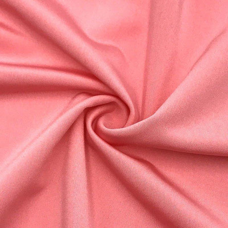
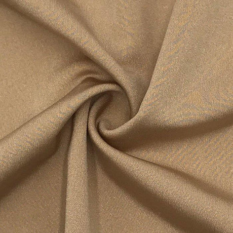
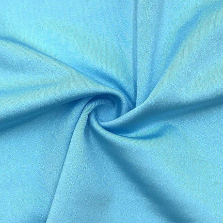
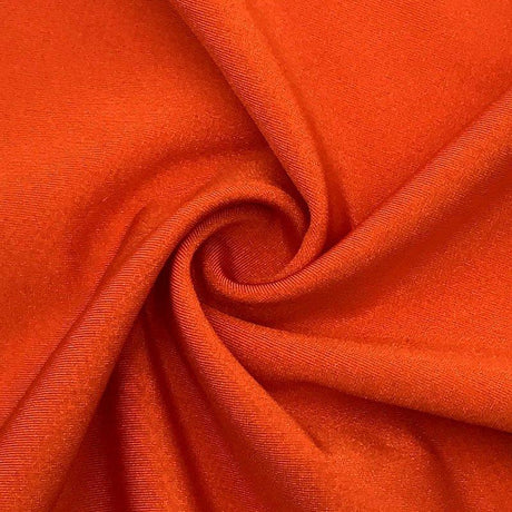
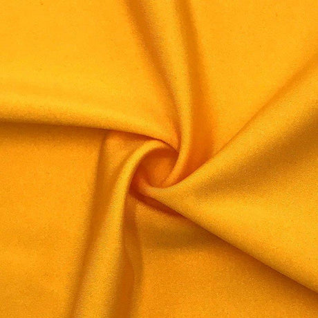
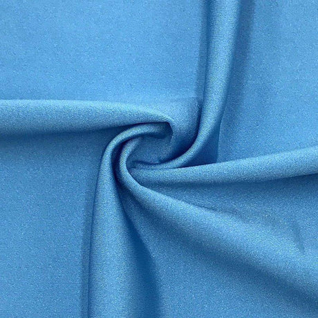
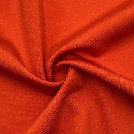
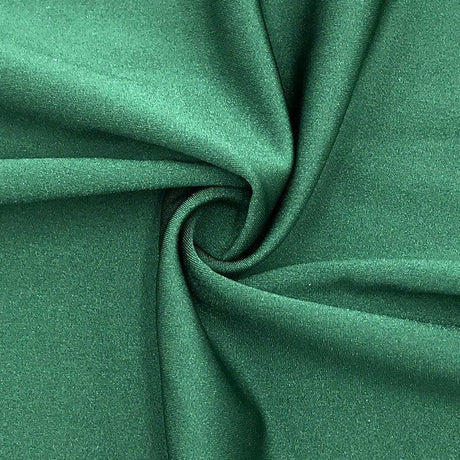
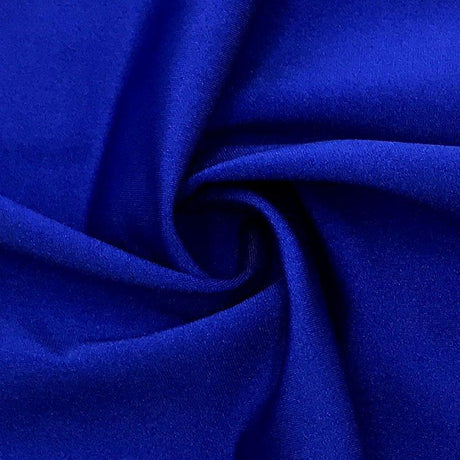
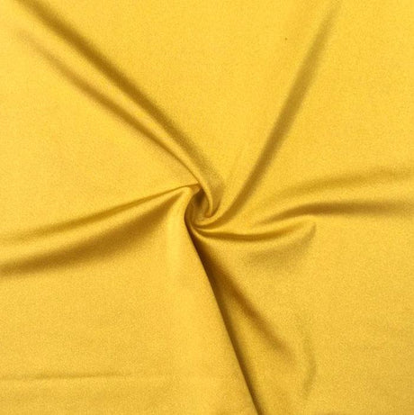
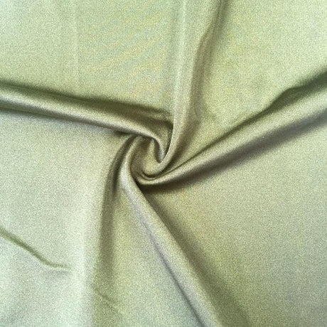
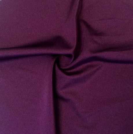
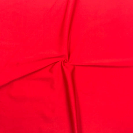
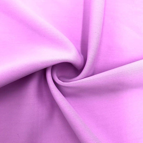
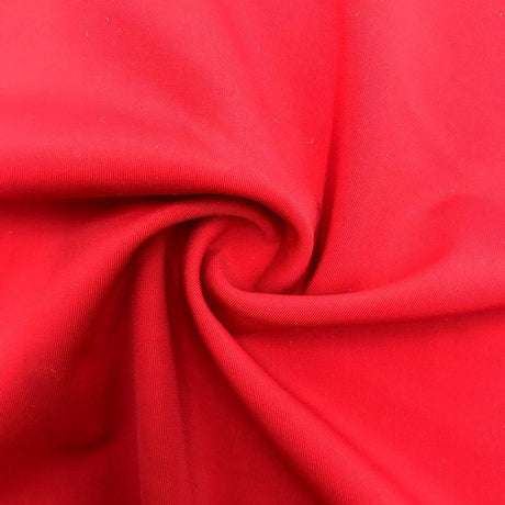
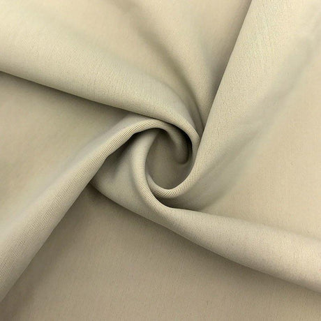
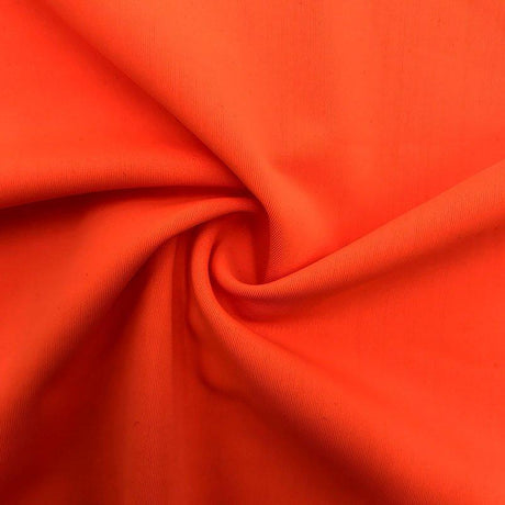
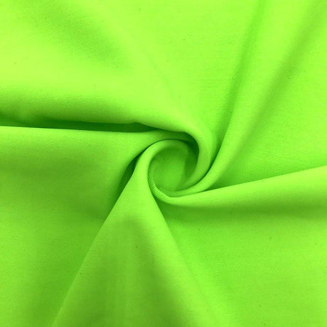
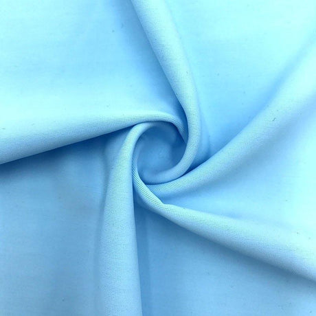
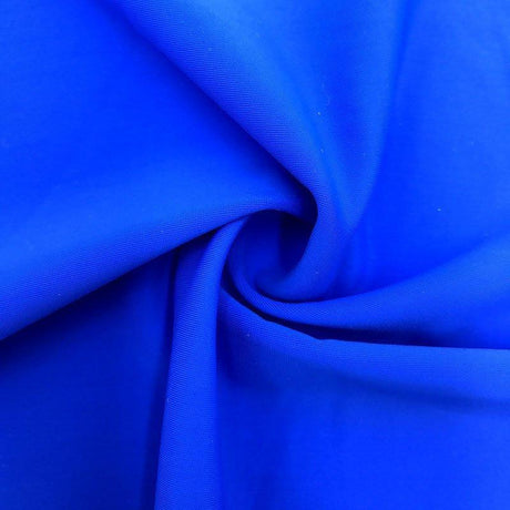
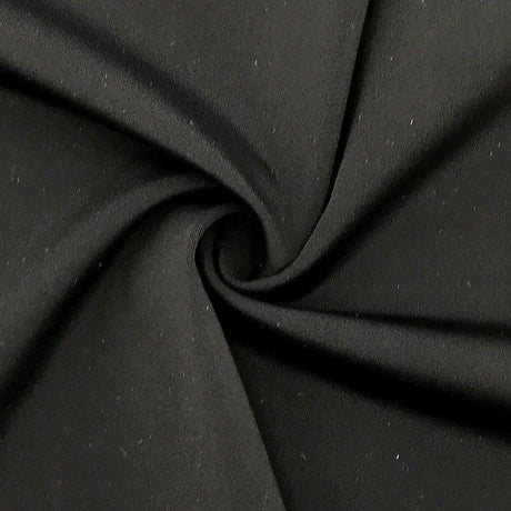
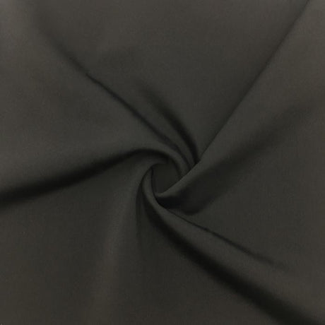
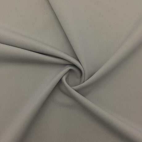
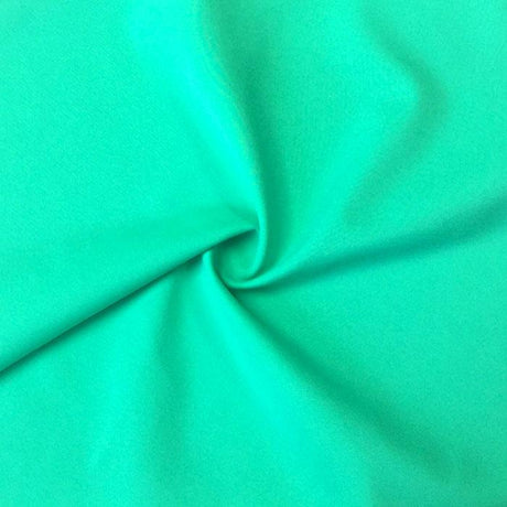
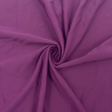
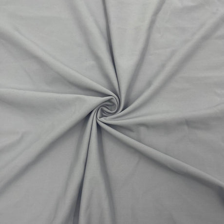
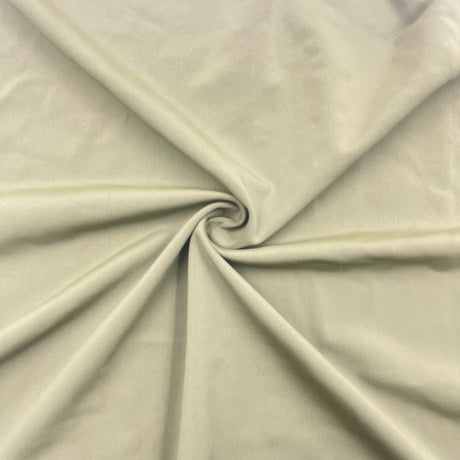
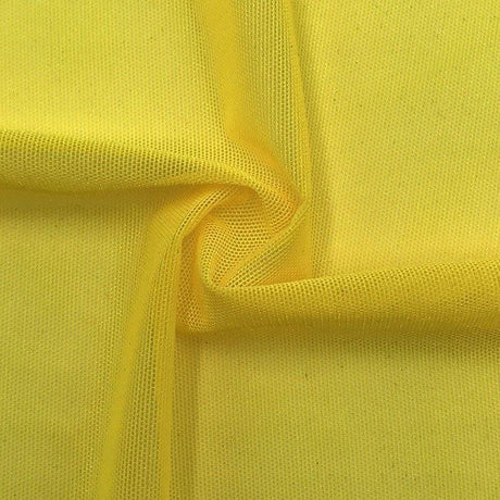
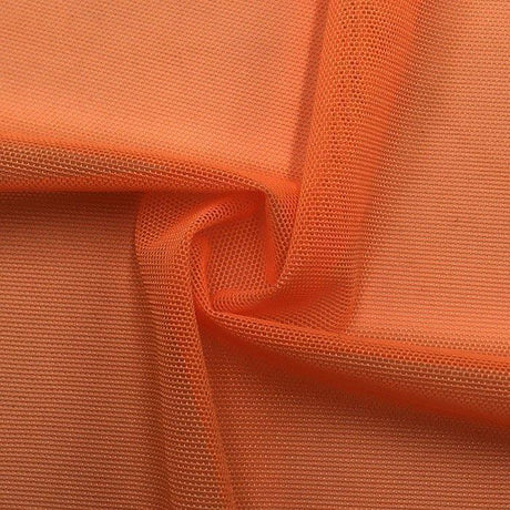
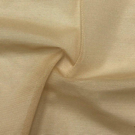
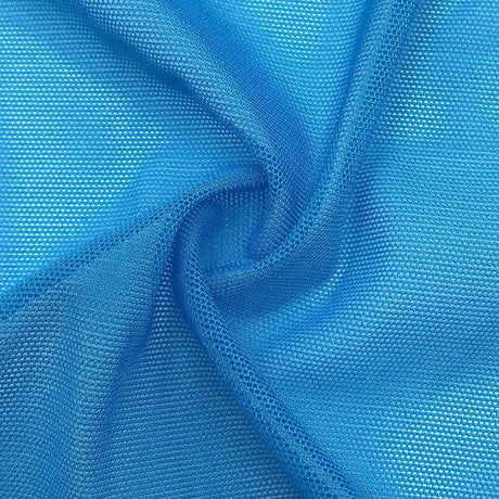
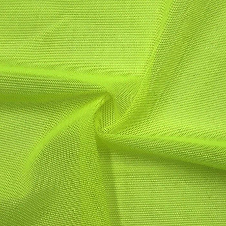
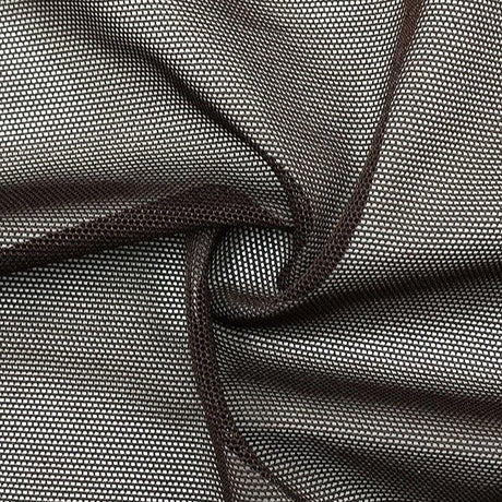
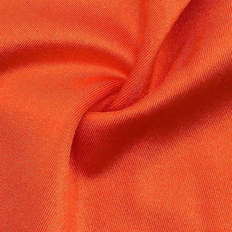
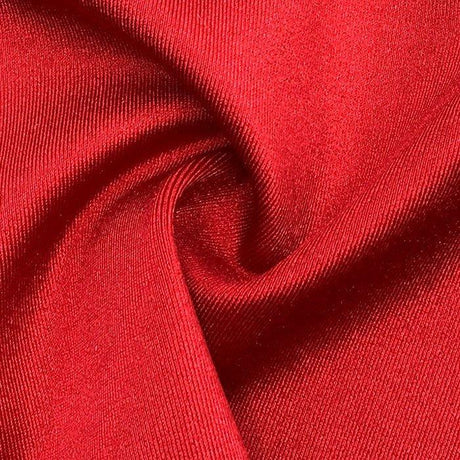
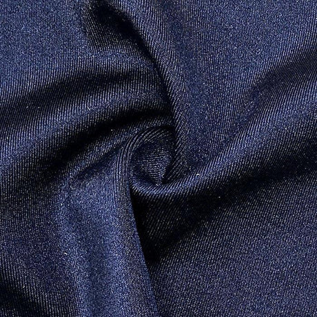
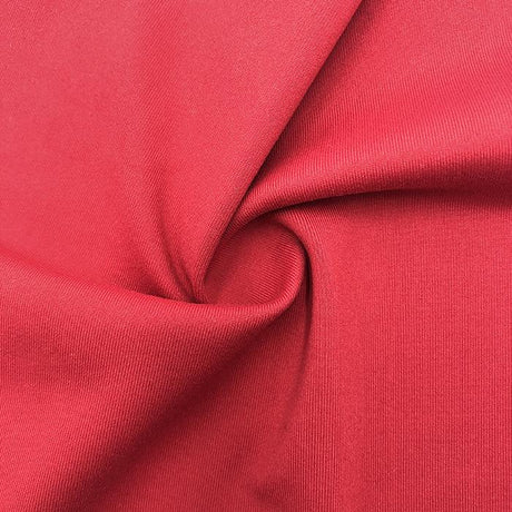
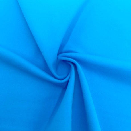
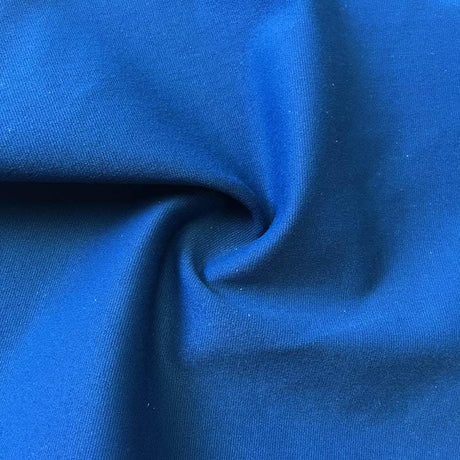
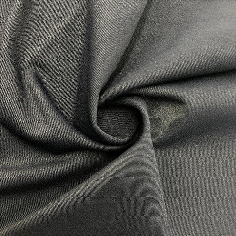
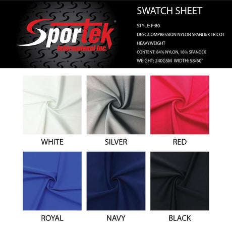
Not all swimwear fabrics behave the same, especially when it comes to prints. The two most common base materials are nylon (polyamide) blends and polyester blends, both mixed with a portion of spandex (elastane) for stretch. Each has its quirks in terms of stretch percentage, weight (GSM), and how they take print. Understanding these differences will help you plan print placement more effectively (and choose the right fabric for your project – see our guide on base fabrics for swimwear).
To compare, here’s a quick overview of nylon/spandex vs. polyester/spandex swim fabrics:
|
Fabric Type |
Composition (Typical) |
Weight (GSM) |
Stretch & Recovery |
Print & Performance Characteristics |
|
Nylon Spandex |
~80–85% Nylon, 15–20% Elastane |
~180–200 gsm |
Excellent 4-way stretch (often 50–70% in both directions); very soft hand, “second skin” feel. |
Absorbs ink/dye well – prints can be vibrant with sharp detail. Colors often look rich, and digital printing on nylon can achieve lifelike detail. However, nylon is slightly less chlorine-resistant, so repeated pool use may fade the fabric or print faster. Best for fashion swimwear, boutique designs, or any application where a luxurious feel and vivid print are priorities. |
|
Polyester Spandex |
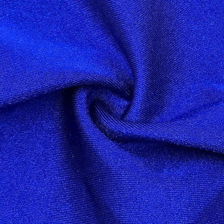
~80–85% Polyester, 15–20% Elastane |
~200–220 gsm |
Excellent 4-way stretch (often 50–60% horizontal, 30–50% vertical); a bit firmer stretch and not as silky-soft as nylon. |
Highly chlorine and UV resistant – poly blends “hold up like a champ” against chlorine and sun, keeping the swimsuit vibrant and stretchy for the long haul. Prints are typically applied via sublimation (dye-infusing) which yields permanent, saturated color that won’t crack or peel. Polyester prints are very durable and colors stay bright, though the printing method requires a nearly white base fabric. Slightly easier to sew due to stable stretch, and ideal for active or competitive swimwear where longevity is key. |
|
Others (PBT Polyester, etc.) |
E.g. 100% PBT Polyester or blends |
~150–170 gsm |
2-way or mechanical stretch; high resilience. |
PBT (a type of polyester) is often used in competition swim team suits for its extreme chlorine resistance. Prints on PBT or similar are usually sublimated. These fabrics are very durable but have less elastic stretch and are less common for fashion prints. Use for performance suits where print placement is simpler (often abstract patterns) and longevity trumps aesthetics. |
(GSM = grams per square meter, a measure of fabric weight. Higher GSM often means a thicker, potentially less stretchy fabric.)
A few technical notes: Nylon vs. Polyester for printing – Nylon tends to take color deeply and vividly, which is why print detail on nylon/spandex can look exceptionally sharp. If you’re after a photorealistic or very detailed print, and you don’t mind a bit of extra cost, printing on a nylon blend via digital methods (or using pre-printed nylon spandex fabric) is a great choice. Polyester, on the other hand, holds color through wear and wash like a champion. With sublimation printing on poly, the ink actually becomes part of the fiber, so the print won’t fade or crack and can stretch without issue. The trade-off is that sublimation only works on polyester-rich fabric – it literally will not bond to cotton or true nylon. So if you love a polyester blend’s durability, you’ll likely be using sublimated all-over prints or ordering custom prints on polyester base. If you’re working with a nylon-based swim fabric and want a custom print, look for digital printing services that cater to nylon swim fabrics (often using special dye inks or processes) – these can achieve brilliant results on nylon. For more on print options for nylon, see nylon swim-friendly prints.
Lastly, consider stretch variation and print distortion: A print may appear differently on a fabric with higher stretch percentage versus one with a lower stretch. For example, a 75% stretch fabric (very elastic) will potentially distort a print more on the body than a fabric with just 25% stretch. When planning placement, account for how much the fabric will stretch at different points. High-elastane fabrics (10–20% spandex) generally recover well, meaning the print bounces back, but if a fabric bag out or doesn’t fully recover, the print could look warped over time. Always do a stretch test on your fabric and see if the print skews. Some designers even redraw or adjust a motif’s shape on paper to compensate (especially for logos or geometric placement prints, they might print them slightly squashed so that when the fabric stretches on the body, the logo looks normal).
Digital Printing & Scale Considerations
Choosing the right printing method for your swimwear fabric goes hand-in-hand with print placement strategy. The method affects how precisely you can place a design and what scale of print works best. Here are some key considerations:
- Large Motifs vs. Small Repeats: In swimwear, scale is crucial. Because swimsuit pattern pieces are relatively small (think of a bikini triangle or a swimsuit bra cup), overly large motifs can get cut off or barely show. It’s often safer to stick to a smaller scale print for swimwear – this way the design is visible in its entirety on each piece. If you adore a large, bold motif, you might need to turn it into a placement print, carefully centered on the garment (more on that below). Otherwise, large prints on a tiny bikini might result in weird partial graphics that don’t do the design justice.
- Digital Printing Precision: Digital textile printing (direct-to-fabric inkjet printing) offers a lot of flexibility for swimwear. It can print high-resolution, photo-like designs and doesn’t require a repeat pattern – you can print your fabric with engineered placement prints right on it if you want. This is how some manufacturers achieve swimsuits with a graphic or illustration perfectly centered; they print the garment pieces with the artwork already positioned. Digital printing works on many fabric types (including polyester blends and even nylon, with the right inks). The placement accuracy is high on the fabric, but you still have to cut the pieces exactly as intended. One thing to note is fabric roll variance: if you’re printing a long roll of fabric digitally, there can be slight shifts in print alignment or scale from start to end of the roll (or between batches). Always get a strike-off (test print) and check that the scale and colors match your expectations across the yardage. Also be aware that digitally printed yardage might have minor alignment drift – it’s wise not to align pattern pieces at the extreme edge of a design; leave a little margin in case of any drift or shrinkage during printing/finishing.
- Understanding Fabric Roll Variance: Even with sublimation (which prints from paper to fabric), fabrics can shrink a bit during the heat process, and registration can vary. This means if you plan a print to hit an exact spot on a pattern piece in mass production, you must communicate clearly with your printer or factory. Each garment might not come out identically unless you go for true placement printing on each piece. In general, all-over prints (AOP) are printed on continuous yardage and then cut in the most economical way, so the print position will naturally vary piece to piece. If you require that every swimsuit has the exact same part of the print in the center, you are essentially asking for a placement print on each, which is less efficient and more costly. Manufacturers can accommodate it by carefully positioning the marker (pattern layout) on the printed fabric, but expect higher waste. It’s a trade-off: absolute consistency in print placement = higher cost and likely fabric waste.
- Choosing Sublimation vs Digital for Placement Needs: As mentioned, sublimation printing is fantastic for all-over designs on polyester – it’s cost-effective at scale and extremely durable. However, sublimation requires printing an entire roll or large fabric pieces with a repeating design. If your swimsuit design involves a specific placement (say a big logo on one hip), you might actually produce that by sublimating a panel with the logo positioned on it (essentially a hybrid approach). Digital printing, by contrast, can print smaller batches or even individual panels with exact designs, which is great for prototyping or smaller brands. Keep in mind digital’s per-unit cost is higher than bulk sublimation, but you gain flexibility. Also, color vibrancy and fastness can differ: sublimation colors generally won’t fade and are very vivid on poly, whereas digital prints on nylon need proper fixation and possibly a protective topcoat for equal durability. Evaluate what matters for your project – if you need a large tropical flower precisely centered on a one-piece, you might lean toward digital or a screen print transfer for that panel. If you just need a nice pattern all over, sublimation on polyester fabric is king.
- Print Scale & Design Cohesion: Consider how the print looks across the whole garment in proportion. Swimsuits are dynamic – they stretch, they curve around the body. A print that’s too small can look busy or dizzying on a curvy figure, while one that’s too large can lose its identity when only a small portion shows. Often a medium-scale print (e.g. motifs 2–3 inches in size, repeating) works well for adult swimwear – it’s discernible but not overpowering. You should also balance color distribution in the print. If one area of the fabric is solid blue and another area is densely patterned, and you happen to cut one cup from the blue area and the other cup from the patterned area, the bikini top will look mismatched. A well-designed swim print has fairly even color and motif spread, so any two pieces cut from it still look like they belong together. When designing or selecting prints, aim for uniformity across the fabric or plan your cutting layout to avoid obvious color-block mismatches.
In summary, match your printing method and design scale to your project’s needs. Use digital printing for precision placement or complex art, and keep print scale appropriate for the garment size. And always communicate with your print supplier about tolerances – knowing the limits of the medium will save you from unpleasant surprises when you go to cut your fabric.
Print Layout Strategy Before Cutting
Once you have your fabric and print ready, the next crucial step is planning your layout before you cut. This is where you ensure each pattern piece is placed on the fabric in just the right spot. Rushing this step can ruin all your careful design work, so let’s break down a smart layout strategy.

An example of careful print layout: swimwear pattern pieces are being arranged on a printed fabric one by one. Cutting on a single layer (fabric not folded) allows total control over motif placement. Notice how the large flower on the fabric is deliberately positioned so it won’t end up in an awkward spot on the final suit. Taking time with this layout step ensures symmetry and a professional look.
Key Steps Before Cutting (Checklist):
- Work on a single layer of fabric: Always lay your swimwear fabric right side up, in a single layer when positioning pattern pieces for cutting. Don’t fold the fabric as you might for solids, because a print’s placement can shift or mirror unexpectedly on the underside. Cutting each piece one at a time lets you see exactly what part of the print will show on the garment. This also prevents the print on the under-layer from accidentally being upside down or misaligned. It helps to have your cutting table completely cleared and to smooth the fabric out without distortion.
- Orient pattern pieces with stretch direction and print in mind: Most swim patterns indicate the direction of greatest stretch (usually horizontal around the body). Make sure to align the grainline or stretch line on your pattern with the fabric’s stretch direction every time, even as you focus on the print. This way, you won’t accidentally cut a piece that won’t stretch properly around the body. Also consider the print’s orientation: if the print has an obvious direction (like upright flowers or text), ensure all pieces are placed so the print will be right-side up on the wearer. A quick mental check: imagine the person wearing the suit and make sure any motifs aren’t upside-down (nobody wants a pineapple print that’s inverted on one half of the bikini!).
- Position motifs deliberately: Look at each pattern piece and decide what you want centered or featured on it. For example, for a bikini bottom, you might decide to center a cluster of flowers on the back and avoid any single flower dead-center on the crotch panel. For a bikini top or bra cup, maybe you want a nice part of the print (like a palm leaf) to spread across the cup, rather than a half motif that will look cut off. If your fabric has a symmetrical pattern, you might center the symmetry on the center front of a one-piece suit. Mark the key points on your pattern (you can lightly chalk the fabric where the pattern piece will lie) to guide placement. Be especially mindful of “risky” motifs as noted earlier – for instance, place large, bold elements on parts of the body that can carry them (like the side of the hip, or upper chest) and keep them away from more sensitive areas.
- Ensure pairs are mirrored or identical as needed: For any pieces that come in left/right pairs (like bra cups, or left/right half of a front), decide if you want them mirrored (a reflection of each other) or identical in print placement. Mirroring often looks pleasing for prints that have a clear direction or symmetry. To do this, you would place one piece, then flip the pattern piece over or use a double of the pattern, aligning it so the print on the second piece mirrors the first. Identical placement (where both sides look the same) is harder with random prints – it may require cutting both sides from the exact same area of a repeat, which can waste fabric. At minimum, try to have them similar in color and scale so one side doesn’t visually outweigh the other. Center any central motifs along the center line of the garment for symmetry.
- Match across seams when possible: If your design has a continuous print that you want to flow nicely, take extra time for this. For example, if you have a one-piece with a front seam, you might want the stripes or pattern to line up at the seam so it looks uninterrupted. This can be tricky on 3D curves, but you can at least align major lines or repeats. On side seams, decide if it’s worth matching – for busy florals it may not matter, but for geometrics or stripes it definitely does. You may nudge pattern pieces up or down by a few millimeters on the fabric to get a better match; just be careful not to distort grainline. Attention to these details really elevates the final product, giving it that ready-to-wear polish.
- Use guides or templates: Here’s a pro tip if you’re unsure about placement: create a print layout guide. You can trace your pattern pieces onto a piece of clear plastic or Swedish tracing paper, then draw in some of the key print motifs on that outline. This way you have a transparent pattern piece with the print pattern on it, which you can lay over your fabric to preview how the cut will look. Some designers will even take a photo of the fabric and overlay pattern shapes in software, but doing it by hand works too. This technique is essentially simulating the print placement before you cut. As one print expert suggests, you can cut out paper bikini shapes and lay them on your fabric to visualize the result – it really helps catch any awkward placements before it’s too late.
- Checklist before you cut: Once all pieces are laid out, do a final check: Are all pattern pieces present and accounted for? Did you double-check that none are placed upside down relative to the print’s intended direction? Are mirrored pieces correctly mirrored? Check that the stretch direction is correct on each piece (this is worth repeating – a mistake here can ruin fit). Take a step back and look at the overall layout – does it look balanced? If it helps, take a photo of your planned layout. This gives you a reference in case you get interrupted while cutting or if you need to replicate the layout for a small production run. Finally, ensure the fabric is completely flat, and use sharp cutting tools. A rotary cutter with pattern weights (instead of lifting the fabric with scissors) is ideal for slippery swim fabrics – it minimizes shifting and keeps those motifs exactly where you want them.
- Choose the right fabric & print for your style: This is a preliminary step, but worth noting in your layout plan. If you find yourself struggling to place a huge print on a tiny swimsuit pattern, it might be a sign the print is not ideal for that style. Save that print for a larger garment and opt for a smaller-scale or more abstract print for the swimsuit. Also, using a fabric specifically made for swimwear printing (with good stretch and colorfast print) will make your life easier. For instance, a printed stretch fabric designed for swim styles [printed stretch fabric for swim styles] will have print longevity and stretch in mind, so you won’t be fighting its properties during layout. Starting with the right material sets you up for success when you get to cutting.
By following this layout strategy, you greatly increase the chances that your finished swimwear will have a clean, intentional look. It takes some extra time upfront, but it’s far better than the heartache of realizing after sewing that a flower landed in the worst possible spot. The goal is a swimsuit that looks well-planned and professional, with the print enhancing the design in all the right ways.
How to Choose Print Placement Based on Project Type
Different swimwear projects call for different print placement approaches. A sporty one-piece for lap swimming isn’t handled the same way as a trendy cut-out monokini for the beach, and kids’ swimsuits have their own quirks. Let’s break down print placement tips by project type:
- Performance/Active Swimwear: For athletic swimsuits (think competitive swim team suits, racing one-pieces, surf rashguards, etc.), function comes first. These suits undergo a lot of stretch and stress. Often, they use polyester fabrics for durability, with all-over prints or solid colors being common. If you’re using a print, small-scale, continuous patterns or abstract designs work best – they won’t look odd when the fabric is stretched to its limit. You’ll want to avoid any print placement that could distract or feel uncomfortable during movement. For example, a big placement graphic on the stomach might crack or impede stretch during vigorous motion, and a poorly placed motif at a flex point could distort and look strange mid-stretch. Many active swimsuits use wild prints (like colorful geometrics or camo) but they are all-over and non-placed, so the athlete doesn’t have to worry about symmetry or alignment while wearing it. If your active swim project has side panels or contrasting pieces, consider using color blocking – a solid color in high-stretch areas (like side panels) and a print in areas that remain relatively stable. This not only looks sporty but reduces print distortion in sensitive zones. In summary: opt for prints that can handle stretching (both in terms of fabric quality and design that hides distortion), and place any bold elements in areas that won’t interfere with performance (e.g., upper back, side of a leg, rather than across shoulders or waist which bend a lot).
- Fashion Swimwear (Trendy bikinis, cut-outs, etc.): In fashion-forward or luxury swimwear, aesthetics take center stage. Here you might deliberately use placement prints for visual impact – for instance, a one-piece with a huge tropical flower spanning from the torso to the hip, or a bikini with a baroque motif placed at the center. These designs often require meticulous planning and sometimes printing custom panels so that the motif lands exactly where intended. When choosing print placement for fashion swimwear, think about the silhouette and focal points of the design. A high-waisted bikini bottom might be a great canvas for a centered motif, whereas a plunge-front one-piece could use a mirrored print along the neckline for symmetry. Symmetry vs. asymmetry is a design choice: symmetrical placement (mirrored left to right) can give a very polished, classic look, whereas an off-center placement print can be artsy and eye-catching (like a large design on one side of the suit only, which can actually flatter by drawing the eye and enhancing curves). Just remember that bold placement prints in fashion swimwear still need to be backed up by technical execution – you’ll likely be using either engineered printed fabric or even printing after some construction. Also, consider the base fabric: nylon/spandex is popular in fashion swim for its comfort, and if you use it, a digital print might be your method for those custom motifs. Fashion swim is where you can get creative, but don’t overdo too many focal prints on one small suit – usually one major placement element per garment is enough, complemented by smaller coordinating patterns or solids elsewhere.
- Kids’ Swimwear: Designing prints and their placement for kids is a fun endeavor, but it comes with practical considerations. Kids’ swimsuits are small, so prints should generally be small-scale and whimsical. Large prints will simply get lost or chopped up on tiny pattern pieces. Also, think about the themes – often kids’ swimwear features conversational prints (animals, cartoons, fruits, etc.). When placing these, try to avoid having half a character on a seam (you don’t want a dinosaur missing its head because the side seam ate it!). It can be helpful to downsize the print compared to an adult version, so that the full motif appears multiple times on a child’s garment rather than one big motif that doesn’t fit. Another consideration is that kids move a lot and might not notice if something is upside down or mismatched – but the parent buying the suit will notice. So you still want a pleasing arrangement. Center front placements (like a cute graphic on the chest of a rash guard or one-piece) can work well for kids, and because their suits often have more ease (less extreme negative ease than adult fashion swim), a chest graphic won’t distort as much. Just be sure any print is colorfast and non-irritating (the inks should be safe) since kids have sensitive skin. From a manufacturing perspective, kidswear can tolerate a bit more print variation (nobody expects each size 4T swimsuit to have identical print placement, especially if it’s an all-over print). So economically, you’ll likely cut it like normal fabric. Focus on cheerful, small repeats and avoid placing anything that could look odd when a child is wearing a diaper or swim diaper underneath (for toddlers, for instance). One more tip: because kids outgrow suits quickly, using very expensive placement printing might not be worth it – save the ultra-precise placements for adult pieces and keep kids’ designs simpler and cost-effective.
- Activewear vs. Fashion vs. Kids Summary: To choose the best approach, identify the primary goal of the project. If it’s performance, lean toward subtle prints or all-over patterns that require minimal placement fuss and won’t hinder movement or durability. If it’s fashion, decide on your statement – a placement print can be the star, just be ready to put in the work (and possibly extra cost) to execute it flawlessly. If it’s kids, prioritize fun and practicality – smaller, repeating prints that look cute and aligned without needing obsessive precision. In all cases, match the fabric type to the project (e.g., poly for athletic durability, maybe nylon or poly for fashion depending on print method, anything goes for kids but poly might endure rough play better).
Lastly, consider the print’s theme relative to the audience. A bold edgy print might be great for a trendy women’s swimsuit but not for a child’s, and vice versa a juvenile print wouldn’t suit an adult fashion bikini. The placement should complement the body wearing it: e.g., placing a flattering curved motif at the waist of a women’s one-piece can visually slim or accentuate, whereas for a child that’s not relevant – you might just center a cute image because it’s fun. Always circle back to who will wear it and where (beach fashion shoot vs. lap swimming vs. toddler at the pool) and let that guide your print placement decisions.
Common Mistakes to Avoid
Even experienced designers and sewists make mistakes with print placement. Here are some common pitfalls and how to avoid them in your swimwear projects:
- Ignoring Stretch Direction (Grain) During Layout: A frequent error is to focus so much on the print’s look that you forget the technical requirement of placing pattern pieces on the correct grain/stretch orientation. If you cut a piece with the stretch going the wrong way, the swimsuit may not fit or the print may distort oddly when worn. Always align the pattern’s indicated direction with the fabric’s stretch. For instance, the torso of a one-piece usually needs the greatest stretch going around the body (horizontally). If you accidentally cut it rotated 90°, the suit might be too tight around the body and the print could look “pulled” vertically. This mistake can ruin both the garment’s fit and the print’s appearance. Double-check every pattern piece’s alignment before cutting. It helps to lay a ruler or the edge of a pattern along the fabric’s grain or fold to be sure you haven’t inadvertently tilted anything.
- “Floating” or Off-Center Main Motifs: Another error is when a dominant motif is not placed with intention – it might end up awkwardly off-center or cut off. For example, if your fabric has large flowers and you just cut out pattern pieces randomly, you might get one big half-flower at the seam that looks like a mistake. If there is a principal element in the print (a big flower, an animal, a logo), don’t let it land randomly. Either center it nicely on a panel or ensure it’s completely absent from that panel. Half of a motif or one that’s just slightly off from center can look like a misprint. Avoid the “one-eye” effect – e.g., a bikini cup with half a sun on it might look like an eye staring, or two bikini cups with parts of a face that don’t align can be very unsettling! The remedy is to always identify any big or obvious shapes in your fabric and plan where (or if) they will appear on each piece.
- Accidental Emphasis on Body Areas: We touched on this earlier – placing a bold shape right on a sensitive area. It’s a mistake that can slip in if you’re not paying attention for even a moment while cutting. Common no-nos include: a round target-like motif over the bust apex or butt, a vertical motif over the crotch (especially something that could be seen as phallic – eek!), or any motif that when mirrored by the body’s two sides creates an unfortunate image (there are humorous examples out there of people who ended up with two halves of a watermelon that look like a cartoonish bra, etc.). To avoid this, after you place your pattern pieces, imagine the garment on a person and examine every motif’s position. If something makes you even slightly unsure, adjust the placement. It’s better to use a less prominent part of the print in a risky zone and showcase big motifs in safer zones (like mid-thigh of a swim short, upper chest, upper back, etc.). Always remember that what’s funny or awkward in hindsight can be prevented with foresight – take the time to review before cutting.
- Forgetting Print Repeat Alignment: If you’re working with an all-over print that has a discernible repeat (like stripes, plaids, or any linear pattern), forgetting to align the print across pieces is a big mistake. This can result in a jarring mismatch at side seams or between a top and bottom that are supposed to go together. For instance, if you sew a tankini top and bottom in a stripe and the stripes don’t line up at the waist, it will draw the eye (and not in a good way). The fix is straightforward: when laying out, use notches or visual cues on the fabric to align pieces that will be joined. Mark where a stripe hits the edge of one pattern piece and place the adjacent piece so the stripe continues. It’s extra effort, but it distinguishes a well-made garment. When matching isn’t possible (say, a very curved seam or a complex print), at least choose a busy print where the mismatch isn’t obvious, or break it up with a solid contrast trim so there’s no expectation of continuity.
- Not Accounting for Negative Space and Color Balance: Negative space refers to the background or empty areas in a print. A mistake here is cutting a piece that ends up being only negative space – for example, imagine a bikini bottom cut from a section of fabric that just happened to have no flowers, just background color, while the rest of the suit has florals. That bottom will look oddly plain compared to the top. Similarly, you don’t want one side of the body heavy with print and the other side mostly background. To avoid this, observe the distribution of your print. If your print has large open areas and dense areas, try to capture a similar mix in each major pattern piece. Balance the color and motif spread so one sleeve isn’t all dark blue background while the other sleeve is covered in the bright print. As cited earlier, ensure no one piece is an outlier (like two printed cups and a solid-looking bottom from the same fabric – it can happen if the bottom was cut from a blank area of the print). If needed, you can place pattern pieces slightly sacrificially (less efficient) to grab a bit of motif for a balanced look. This is also where laying out all pieces before cutting helps – you can see the overall balance and adjust. A pro trick: If you have some flexibility with extra fabric, cut two options for a piece (one from a busier section, one from a plainer section) and later decide which looks better when you see the pieces together.
- Skipping the Test Fit/Stretch Check: This is more of a process mistake. If you place prints perfectly on paper but then the body stretches the suit in an unforeseen way, you might be unhappy. For example, maybe you placed a horizontal stripe pattern straight across the torso. On paper it looks fine, but on the body, the stripe might curve upward over the bust and downward at the sides due to body shape, creating a wavy line optical illusion. If you have time, baste together the main pieces of the suit and put it on a dress form or fit model before finalizing. Check that the print is doing what you wanted. Are those two mirrored motifs actually looking mirror-imaged on the body? Is that centered graphic truly centered once the fabric stretches over curves? If something has shifted (it can happen – the act of sewing, especially with linings and elastic, can move motifs a bit), you can still adjust in the next iteration. Skipping this step is a mistake if you are doing a production run or a very important piece. A quick fit check can save you from replicating a print placement error across dozens of garments.
- Neglecting Fabric/Ink Behavior: Common mistake: choosing a printing method or ink that isn’t suited to your fabric, which then affects placement outcome. For example, using sublimation on a nylon fabric – the print might look faded or may wash out because sublimation ink doesn’t properly bond to nylon. If you didn’t realize that and planned a very intricate placement, you’ll be in trouble when the print bleeds or vanishes. Or using a heat transfer on a super stretchy fabric without stretching during application – the first time the suit is worn, the design might crack. Always ensure your print method and fabric are compatible and test a swatch. The mistake is to assume all printing is the same. Each has quirks: screen prints might feel rubbery if large, digital prints on dark fabric may require a white base that could show edges, etc. Know these things before finalizing your placement so you can account for them (for instance, add bleed area around a placement print so a white base doesn’t peek at edges, etc.).
Avoiding these mistakes comes down to planning, testing, and attention to detail. It might feel like a lot of cautionary tales, but once you know the common pitfalls, they’re easy to sidestep. The result will be swimwear with prints that look expertly placed and beautiful, with no “if only I had noticed that earlier” moments.
When to Use Solid or Semi-Printed Alternatives
With all the complexity of print placement, you might wonder: are there times when it’s better to skip the print or use only a little of it? Absolutely. In some cases, using a solid color or a subtle texture can achieve a better result in terms of both aesthetics and practicality. Here’s when and why you might opt for solid or semi-printed alternatives:
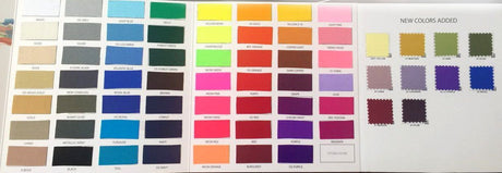
- To Simplify Construction and Reduce Waste: Intricate prints often mean you need extra yardage (to place pieces optimally) and more time aligning everything. If a project’s budget or timeline is tight, consider using a solid fabric or a very simple all-over print that doesn’t require matching. Color blocking is a popular swimwear design technique that can replace complex prints – for example, a swimsuit with solid black side panels and a printed front panel achieves visual interest with less print to worry about. This reduces waste since you’re only fussy-cutting one panel, not every piece. If you adore a particular expensive print, you can use it sparingly (like just on the bikini top, paired with solid bottoms) to get the look without the cost of fully printed yardage for both. Solids are also generally cheaper per yard and easier to source in recyclable or eco options, which might align better with production constraints.
- When Print Placement Would Be Too Complex: Some design ideas just become a nightmare of engineering if you insist on a print. Let’s say you want a swimsuit with lots of cut-outs or intricate style lines. Trying to align a bold print across all those seams could drive you insane (and might not even be noticeable in the end). In such cases, a solid color might actually highlight the style lines better. Or you might choose a textured fabric (like a ribbed or embossed solid) to give visual interest without any print at all. Textured swim fabrics have become popular because they add depth and luxury without needing a printed pattern. For example, a rib-knit swim fabric in a solid color can look very upscale and you bypass all print matching issues. Use prints where they make sense and solids where they save sanity. A general rule: if you count more than 3 separate pattern pieces that would each need perfect motif placement, strongly consider simplifying.
- For Cost and Yield Efficiency: If you’re manufacturing, every minute and every inch of fabric costs money. As noted earlier, requiring exact placement of prints can significantly up the cost. Solid fabrics allow you to nest pattern pieces tightly and use nearly all your fabric (no worrying that you can’t use a corner because the print won’t match there). So if budget is a concern, consider doing the majority of a collection in solid fabrics or prints that don’t need special placement, and perhaps one signature piece with a wow-factor print. Additionally, if you want to offer many colorways, solids make it easy – you can have the same suit in 5 colors without print logistics. Some brands do a mix: a few printed offerings (which might be priced a bit higher for the extra effort) and a core of mix-and-match solids.
- When the Print Doesn’t Improve the Design: Sometimes, less is more. A busy print on a very elaborate swimsuit design might be overkill – the details get lost in the pattern. In such a case, using a solid or a very minimal print (like a textured dot or a heathered look) might actually showcase your design better. Or if the print placement risk is high (say you have a halter with a twist detail that would inevitably distort any print), you might opt for a solid and perhaps add interest by using a contrasting binding or a small printed accent (like printed ties or a printed ruffle on an otherwise solid suit). This way you get a pop of print without the full commitment.
- Semi-Printed Compromises: Another alternative between all-over print and solid is using panel prints or border prints. These are fabrics that have a design placed in a certain area (like a border along one edge, or a medallion at regular intervals) but are otherwise solid. They can be easier to cut because you know exactly where the print is and you cut your pattern accordingly (often these come with factory-suggested placement). For instance, a border print could be used at the neckline or hem of a swimsuit cover-up or along the top edge of a bikini. It gives a decorative touch without all-over placement hassle. Likewise, using a logo print or small motif in just one spot (via an iron-on or screen print) is common in athletic swimwear – a simple suit with just a small brand logo on the chest. This is technically a placement print, but very contained and low-risk.
- Sustainability and Ethical Production: If you’re concerned about sustainability, know that printing (especially placement printing with wastage) can have a bigger environmental footprint (excess fabric, more ink, more energy). Solids and efficient cutting mean less waste. Also, working with readily available solid fabrics (especially recycled poly or nylon options that are now common) can be more eco-friendly than custom printing yards of fabric. So sometimes the responsible choice is to use that nice recycled solid and maybe incorporate a small piece of print as an accent from a stock printed fabric (some suppliers offer “swim-friendly prints” nylon swim-friendly prints that are pre-tested for colorfastness – using those off-the-shelf prints sparingly can be smarter than printing your own yardage).
- Aesthetics and Trend Cycles: Prints can be very trend-driven (one season it’s palm leaves, next season it’s leopard, etc.), whereas solid colors (or simple color blocks) tend to be more timeless. If you’re making a swimsuit that you want to last style-wise, a solid or a classic print (stripes, polka dots) in strategic placement might age better than the print-of-the-year splashed all over. Consider the end use: if it’s a one-time statement piece, go wild with print; if it’s a wardrobe staple, maybe go solid or minimal.
In conclusion, don’t feel obligated to use a print everywhere. Smart design often mixes and matches – maybe a print for the top, solid bottom, or a printed body with solid trim. Using solids or textured fabrics in combination with prints can highlight the print even more and gives the eye a place to rest. It also cuts down on the headaches of placement. Many high-end swim collections use a strategic approach: a standout print where it counts, complemented by coordinating solids. This approach can actually make the printed portions shine, because they’re framed by simpler elements.
Remember, placement is not only about prints – placing solid color blocks or textured sections is also part of design. For example, a strategically placed solid black side panel can visually sculpt the body (slimming effect), which is something a busy print might not do as well. So use all the tools in your toolbox: prints, solids, textures, and color blocking, to achieve a balanced, cost-effective, and beautiful swimwear line.
Conclusion
Print placement in swimwear is both an art and a science. As we’ve explored, getting it right means thinking about everything from fabric behavior and printing methods to body curves and visual tricks. The key takeaways are: plan ahead, test often, and place with purpose. Always start with the end in mind – envision how the swimsuit will look on a body and let that guide where each motif goes. Use the right fabric for the job (nylon vs polyester) and the right printing method for your design requirements. Don’t shy away from making a bold statement with a placement print, but be prepared to invest the time and effort to execute it properly. And if in doubt, remember that simplicity (like a well-placed solid or a smaller print) can sometimes achieve more than an overly complicated pattern.
In the world of swimwear, placement is both performance and aesthetics. A well-placed print isn’t just about looking good – it can also ensure the fabric stretches and functions as needed (no awkward stress on a printed area, no discomfort from a stiff print overlay, etc.). When you align a print thoughtfully, you’re also aligning with the body’s movement and the garment’s engineering. The result is a swimsuit that not only turns heads on the beach but also fits and feels better for the wearer.
To wrap up, take your time with print placement. It’s one of those details that distinguishes high-quality, professional swimwear from the rest. By educating yourself on fabric types, leveraging the right tools (like our checklist and templates), and learning from common mistakes, you’ll be well on your way to creating swimwear prints that wow. Whether you’re a DIY sewist or a professional manufacturer, the effort you put in before you cut will show in the final product. Happy swimwear designing – may your prints be ever in the right place and your swimsuits a perfect blend of creative flair and technical finesse!